Rekorang | Visual Identity
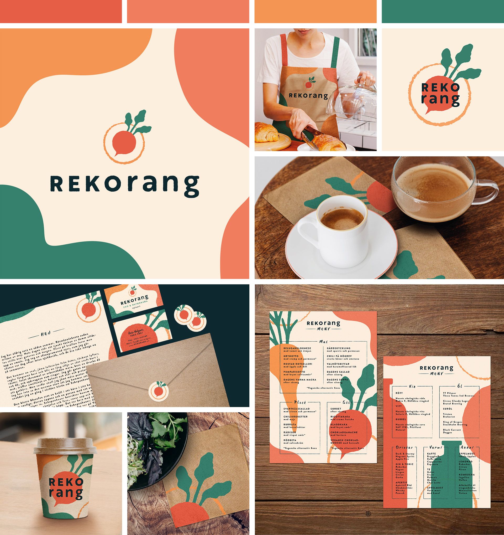
Rekorang is a concept restaurant chain built around locally sourced, organic food. The brief called for a brand identity that felt fresh, trustworthy and down to earth, and my goal was to carry that feeling all the way through, from the first sketch to the last mockup.
The name, a blend of REKO and restaurang, is both clear and playful, and I used that duality as my north star throughout the project. Every decision, from the bold-meets-lowercase logo and hand-illustrated beetroot symbol, to the earthy colour palette and organic shapes, was made to reinforce the same feeling: a brand that takes its values seriously without taking itself too seriously.
The project covers the full brand system; stationery, menu, website, packaging and print, and getting everything to feel like one coherent whole was honestly the part I enjoyed the most.
School project, Berghs School of Communication, 2021
Tools: Adobe Illustrator, Photoshop, InDesign, Procreate